Thursday, February 28, 2013

Four weeks of climate data:
Northern Temperate Region #2


The second slice of the Northern Temperate Zone has its southwestern corner in Egypt and the northeastern corner at the border of the Asian and European parts of Russia. All the major Russian cities are here, as are the Black Sea and Caspian Sea. Most of Iran is in this region as is the rest of the Middle East, except for the countries below the Tropic of Cancer, Oman, Yemen and much of Saudi Arabia.


This region is not as densely populated at Europe, but even so the only gaps we see in the grid are because those grid points are not on land.


Winters are getting warmer, up about two degrees Celsius on all three of our measuring methods, warmest, median and coldest.  Only the median makes this look like a region with an increasing warming trend.


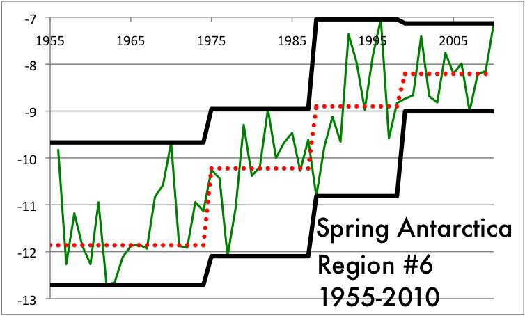
The Spring climate data also shows nearly unanimous warming trends. Only one cool Spring in the 1990s keeps this from all upward steps from left to right in all three categories.


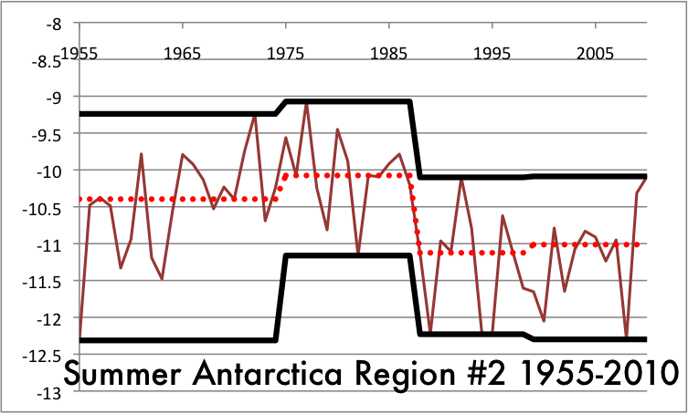
The Summers are only about a degree or so warmer, but here the trend does look to be getting faster as we move from left to right.


The Fall data is not consistently rising from time interval to time interval. There is one downward step in all three of the measurement methods. Still, it's a warming trend in all three categories.

When all the data is taken together, we can be 99% confident this region is warming over time and 95% confident the warming rate is increasing.

Tomorrow, we look at two more slices of the Eastern Hemisphere part of the Northern Temperate Zone, regions that are dominated geographically by the Asian part of Russia, China, Mongolia, Kazakhstan and the north of India.

Four weeks of climate data:
Northern Temperate Region #1


From Antarctica, so remote and sparsely populated, we move to the Northern Temperate Zone, easily the most populated section of the planet. There is so much more territory that we are going to slice this region into 12 parts, each 30 degrees of longitude wide. I'm using a Mercator Projection of the world to show the regions. It's clumsy and does not represent distances well, most notably in the massive sizes of Greenland and Antarctica, but this map does show the outline of nations, which makes it easier to talk about where we are in the world.

Region #1 is a rectangle from Algeria to Finland. It covers almost all of Europe, missing most of Britain and the Iberian Peninsula, and the main bodies of water are the North Sea and the Mediterranean.


Coverage in this region is not a question. The only gaps are bodies of water and some areas of the Sahara.

If this region shows no warming, then climate change would be very unlikely to have any human cause.


The Winters in this interval are tending to be warmer. The coldest Winters are clearly warming time period by time period, while both the median and the record highs jumped up in a big way in the early nineties but have tapered off a bit in the first decade of this century.


The Spring data shows a warming trend and an increasing one. The big jump in highs, median and lows is the transition from the end of the 20th Century to the beginning of the 21st.


The Summer increases are even more noticeable, relatively static from 1955 to 1988, then a big jump in the 90s and another in the 00s.

The rate of increase is not getting larger as we move forward, but that is about the only argument against warming with this data.


The median Summer temperatures jumped a degree and a half Celsius in the 56 years we are considering. The Fall temperatures are not nearly as dramatic, going up less than a degree, but the trend looks to be accelerating, most notably in the jump of the median and record high steps beginning in the 21st Century.

We are well over 99% confident this data shows warming over time. As for an increasing trend in warming, it does not meet the 95% confidence level, but it only missed by a little.

Later today, Northern Temperate Region #2, most of the European part of Russia and a large section of the Middle East.


Wednesday, February 27, 2013

Four weeks of climate data:
Antarctica Region #6


The final slice of Western Antarctica has a lot of coverage compared to other regions of the southern continent, though the coverage is paltry compared to the numbers we will see in the Northern Temperate zone, the part of the planet we start looking at tomorrow.


From the grid marks on the coverage map, we see a few consistent stations on the Peninsula, a few on the mainland shore of the Weddell Sea and at least one that is not on dry land at all.


This data shows a general increase, most notably in coldest Summers, and also a tendency that the rate of warming is slowing down.


Fall shows warming in every trend, but those trend appear to be slowing down.


Yet again, the very strong tendencies are towards getting warmer but the rate slowing down.


The number of increases vs. decreases is 31-5, clear evidence the region is getting warmer.  But the number of times the next step up is less steep than the prior is 17-7, which makes this the first region where we can say with 95% confidence that the rate of warming is slowing down.

In brief, Antarctica is much more of a mixed bag than the Arctic. There are arguments to be made for warming trends in two of six slices, compared to five of six slices in the Arctic. It also gives some evidence to the hypothesis that if there are a critical mass of people nearby, the world might be going through a cooling trend.

Our next laboratory to test this hypothesis in the Northern Temperate Zone, which includes the most densely populated regions on the globe and a few slices that are mostly ocean and should have minimal numbers of readings.  If the populated regions aren't showing warming consistently, this would add to the argument that there is no man-made factor adding to climate change, or if there is it is slight.

We'll start by looking at Region 1 tomorrow, from a southwest corner in the Algerian desert to the Finnish tundra in the northeast.

Stay tuned.


Four weeks of climate data:
Antarctica Region #5


Yesterday evening, we looked at the fourth slice of Antarctica, or failed to look at it may be more precise. That part of the continent has the shoreline in the Ross Sea that is closest to the South Pole. The fifth slice is the part just south of Tierra Del Fuego in South America and contains most of the Antarctic Peninsula. When I was a kid, I thought Antarctica looked like a bird sitting on a nest and the peninsula was like a beak. The thick part of the beak is known as Palmer Land and the Larsen Ice Shelf is tucked in at the curve near the end of the beak on the underside. The Larsen isn't as big as some of the other shelves, but it is the northernmost.


The consistent weather stations are really measuring two grid spaces on the Peninsula. There are weather stations closer to the South Pole, but they aren't consistent over the time period we are looking at.


The record highs of Summer are not getting higher, so the top black line does not show a warming trend. In contrast, both the median and coldest temperatures are showing increase.

The Fall temperatures show the same pattern, not that the warmest season are getting warmer over time, but instead that it's not getting as cold as it used to in the coldest years and the median year is warmer than it used to be. 

Winter tells much the same story.


Only in the Spring months do we see new record high warm temperatures in this century. The coldest Spring data trends obviously up, while the median data has a big jump between the 1975-1988 time interval and the 1988-1999 data

There are 36 stair steps in our four seasons of data. 29 go up from left to right, 4 go down and 3 are too close to call. 29 of 36 is way more than half, and using the test that Sir Ronald Fisher developed for a yes/no set of data like this he first used on the experiment known as The Lady Tasting Tea, we can say with about 99.98% confidence this data shows a warming trend.

For increasing warming, we look at the consecutive steps and see if one is taller or shorter than the previous.  Here there are 24 pieces of data and our count is 15 taller, 8 shorter and 1 too close to call. 15 of 24 does not get us to the 95% confidence level (closer to 88%) so we can say it is a region showing warming, but not increasing warming. This is the first slice of the southern continent to show a warming trend. Later today, the sixth slice, which has more data reporting than any of our previous regions, including the consistent stations farthest south.

Tuesday, February 26, 2013

Four weeks of climate data:
Antarctica Region #4


The fourth slice of Antarctica has the least land mass of the sections so far and only 17 weather stations total. Since 1955 to 2010 covers 56 years, there are 224 seasons to track. The most seasons any of the weather stayed open for is 90. There is not enough data to make discuss the trends in this area.

To compare this sparse coverage to another part of Antarctica, the first region (the one directly south of Africa and Madagascar) has on 22 weather stations covering a much larger area, but two of those stations were able to give readings in over 190 seasons out of 224, so those grid points gave us useful data.

Tomorrow, we move to the next region, just south of Tierra Del Fuego and the Falkland Islands, a region that has at least two grid points we can use for reliable data.

Four weeks of climate data: Antarctica Region #3


Region #3 of Antarctica is directly south of Australia and New Zealand, but a very long way away from either. As this map shows, Tierra Del Fuego in South America is the closest point to the southern continent, while Australia and New Zealand are farther away and southern Africa and Madagascar are further away still.


Yet again, incredibly sparse coverage of the region, one station on near the Ross Sea shelf and another close to the northern shore.


Summer high records showed a warming trend in the 20th Century, but that was canceled out in the 21st Century. This is a pattern we expect if there is no trend one way or another.

The Fall high temperature records look line a cooling trend based on one warm Fall in the 1950s, which only got data from one of the two weather stations.  This is one of those problems with so little coverage. Every other trend looks static.


The Winter high temperatures look to be cooling, but the median and low temperatures look to be warming.


The highs and lows show warming but the median looks fairly static in the Spring readings.

Once again, the null hypothesis must be no trend in either direction and this data doesn't convince us to deny that hypothesis.

Eastern Antarctica has not shown signs of warming over the past 60 years or so.

Later today, the first slice of Western Antarctica, with even less readings than the first three sections of the southern continent.


Monday, February 25, 2013

Four weeks of climate data:
Antarctica Region #2


Continuing in the Eastern half of Antarctica, as remote from humans as any part of the planet can get.


At least this region gets coverage every year from 1955 to 2010 and has 4 of the 100 grid points checking in.  Still, this is very desolate, even compared to the Arctic Circle.


The Summer clear does not show a warming trend. In fact, the record highs and the median would argue this part of Antarctica is actually cooling.


The median in Fall shows some cooling trend, the highs and lows look relatively static. This kind of bouncing around is what we expect in a time interval that is not changing significantly.


Except that the coldest Winter this century was a lot warmer than cold Winters last century, this data looks like a cooling pattern.


There hasn't been a warm Spring to match the record set in the 1970s, but the last interval this century showed a slight uptick.

Once again, if the null hypothesis is no significant change, there is not enough data to dispute it, either as a warming trend or a cooling trend.

Tomorrow, the last Eastern Hemisphere slice and the first Western Hemisphere part.

Four weeks of climate data:
Antarctica Region #1


Welcome to Antarctica. Population: You and the pilot who brought you.

As we will see, most of Antarctica is not being studied and getting reliable data over our time period of 1955 to 2010, two years that had strong La Nñia currents, is going to be problematic.


In every region we will look at, the program I've written cuts it up into a 10 × 10 grid. In this time period, we get only two grid points giving us data.

In the Arctic, even a sparsely covered region like Greenland gave us nine grid points. When we get to the Northern Temperate Zone, coverage will be close to universal everywhere on dry land.


There were no consistent station giving information from 1955 to 1959, so our era starts in 1960. We start in Summer because January is the first full Summer month south of the equator.  This data actually shows a cooling trend.


The Fall trend looks a bit more like warming.


Winter again shows a modest warming trend.


Spring on the other hand looks like it's static or slightly cooling.

If our null hypothesis is there is no significant change, this data does not let us say with any confidence this region is either warming or cooling.

It would be nice if we had more data, but we aren't allowed to make it up.  This kind of sparse coverage and unconvincing data are going to be par for the course on the coldest continent.

This evening, Region #2.

Four weeks of climate data: Six regions for Antarctica


The second slice of the globe we will look at is Antarctica. In the northern polar region, I made the Arctic Circle the cut off line, but in the south I move the region out to the 60° Southern Latitude so the whole of the southern continent is included and nothing else.


We start at 0° Longitude and move east to 60° Longitude East for the first region.
 

60° to 120° Longitude east.


The third slice gets part of the inlet known as the Ross Sea.


Slice #4 is the first part of Western Antartica.


Antarctica has an effective population density of zero people per square mile, even less than Greenland. There's nobody there and there many nearby populated land masses. This region has the closest distance, about 800 miles across Drake's Passage to Tierra Del Fuego, some of the coldest, choppiest seas in the world.
 

Region 6 has another large inlet called the Weddell Sea. The Weddell and Ross Seas are home to the largest of the ice shelves that surround the place.

Later today, we look at the first and second slices, with some surprising results in terms of climate data.