Showing posts with label increasingly warm regions. Show all posts

Tuesday, April 9, 2013

Climate Data:
China and surrounding areas 1955-2010

China is not like the Sahara or Australia. It's farther away from the equator, it's not a mono-climate and it fits rather clumsily in a Mercator rectangle. It's not warming as fast as the Sahara, but it is showing much more warming than Australia. Most climate scientist I've talked to think of 2 degrees Celsius in a century as a "hair on fire number" .82 degrees in 56 years would average out to about 1.5 degrees in 100 year if this keeps up.


The region is very well covered by weather stations.

Of all the seasons, Winter is showing the greatest increase in median temperature from the 1955-1975 era to the 1999-2010 era, about 1.02 degrees Celsius. (The choice of the beginning and ending numbers of these eras is based on Strong La Niña years, for those of you who are new to my posts on climate.)


The Spring red dotted line jumps up by 0.94 degrees Celsius from the first era to the last.


Summer temperatures dipped in the time period from 1975 to 1988, but other than that we see an increasing trend.


Fall temperature also have just one dip, but this one is from the end of last century to the beginning of this one.

Confidence level of warming from time interval to time interval: 99%

Confidence level of the trend showing increasing warming: 94.87%

Average seasonal change in the medians of 1955-1975 to 1999-2010: 0.82° C.

Sunday, April 7, 2013

Climate data:
Sahara Desert 1955-2010

When I first did the climate data, the regions were chopped up along specific latitude and longitude line.  Now I want to look at regions that we think of as being mono-climates. The first one is the Sahara Desert.


Here is a map of the grid which shows where the temperature data was collected. The rectangle I chose was 15° West to 35° East in longitude and 10° North to 35° North in latitude. As you can see, there is a lot of the middle of the desert that is not being measured. Still, there were a total of 42,708 seasonal readings, so this is not a place with next to no data like certain regions of the poles.


Until this century, the Winter temperatures in the Sahara were bouncing around somewhat randomly, even showing a mild cooling trend when we look at the record highs and lows. The median was climbing up but only slightly.

Then came the 1999-2010 time period and things jumped up on both the record highs and record lows.

Change in 1955-1975 median to 1999-2010 median: 0.872° C, more than the worldwide average of about 0.5° C. I arbitrarily consider 1 degree Celsius to be the cut-off for very serious warming.


The Spring data was showing some warming in the last half of the 20th Century and that only increased in the first decade of the 21st.

Change in 1955-1975 median to 1999-2010 median: 1.164° C.

The Summer data shows the classic increasing temperature steps.

Change in 1955-1975 median to 1999-2010 median: 1.1185° C.
The Fall data is also unambiguous.

Change in 1955-1975 median to 1999-2010 median: 1.178° C.
Confidence level of warming from time interval to time interval: 99.999%
Confidence level of the trend showing increasing warming: 97.9%
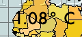
Average seasonal change in the medians of 1955-1975 to 1999-2010: 1.08° C.

Like much of the Arctic Circle and parts of Western Antarctica, the Sahara is one of those regions that show serious warming over these 56 years.

Thursday, February 28, 2013

Four weeks of climate data:
Northern Temperate Region #2


The second slice of the Northern Temperate Zone has its southwestern corner in Egypt and the northeastern corner at the border of the Asian and European parts of Russia. All the major Russian cities are here, as are the Black Sea and Caspian Sea. Most of Iran is in this region as is the rest of the Middle East, except for the countries below the Tropic of Cancer, Oman, Yemen and much of Saudi Arabia.


This region is not as densely populated at Europe, but even so the only gaps we see in the grid are because those grid points are not on land.


Winters are getting warmer, up about two degrees Celsius on all three of our measuring methods, warmest, median and coldest.  Only the median makes this look like a region with an increasing warming trend.


The Spring climate data also shows nearly unanimous warming trends. Only one cool Spring in the 1990s keeps this from all upward steps from left to right in all three categories.


The Summers are only about a degree or so warmer, but here the trend does look to be getting faster as we move from left to right.


The Fall data is not consistently rising from time interval to time interval. There is one downward step in all three of the measurement methods. Still, it's a warming trend in all three categories.

When all the data is taken together, we can be 99% confident this region is warming over time and 95% confident the warming rate is increasing.

Tomorrow, we look at two more slices of the Eastern Hemisphere part of the Northern Temperate Zone, regions that are dominated geographically by the Asian part of Russia, China, Mongolia, Kazakhstan and the north of India.

Friday, February 22, 2013

Four weeks of climate data:
Arctic Circle Region #1


For the Arctic, this is a highly populated area, especially northern Scandinavia.


The blue diamonds are the corners of our region, the upper left diamond is the North Pole. Most of the grid points covered are in the south. All grid points are treated equally if the give at least one reading in a season, but the ones with thicker borders gave readings in all the seasons. The minimum number of readings to qualify is 75%.


Each graph shows the yearly temperature fluctuations. In Winter that line's color is blue. The three other lines are the high median and lowest temperatures in each of our Consistent Oceanic Niña Intervals, 1955-1975, 1975-1988, 1988-1999 and 1999-2010. The low temperature line shows a clear warming pattern, every step higher than the last. The median, shown with the red dotted line, is less conclusive with one dip down, a big tick upwards and flat line between this century and last. The high temperatures show a rise in the record warm Winter, but the rise is small.

Conclusion: Rising, but not rising at an increasing rate.

Spring's data is a little more convincing of a rising trend, especially after 1975, and the median argues that it is rising at an increasing rate.


Summer data more or less mimics Spring. This looks like a warming region and the rate jumped by more than usual.

Until 1999, this region looked to be static, but then there was a big jump. I am categorizing this one a warming region and an increasingly warming region.

Later today, Region #2.